What is CLS?
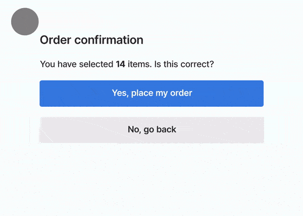
Unexpected layout shifts can disrupt the user experience in many ways, from causing them to lose their place while reading if the text moves suddenly, to making them click the wrong link or button. In some cases, this can do serious damage.
Google considers a CLS score of 0.1 or below as good, 0.1–0.25 needs improvement, and anything above 0.25 is poor. It is one of the three Core Web Vitals that Google uses as a ranking signal.
How to Measure CLS
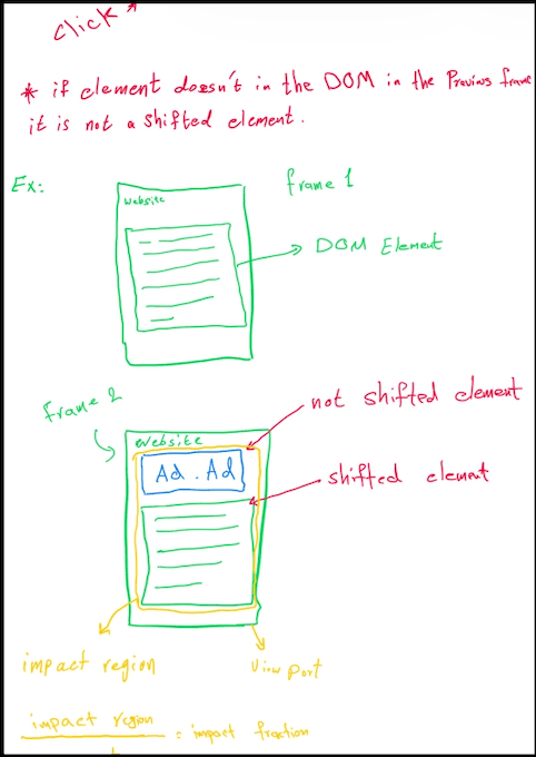
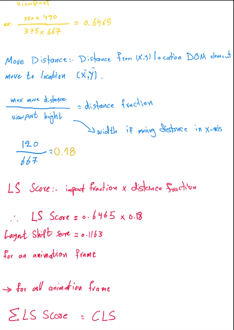
Each individual layout shift score is the product of two fractions:
- Impact fraction — how much of the viewport the unstable element affected
- Distance fraction — how far the element moved relative to the viewport
CLS is the sum of all layout shift scores that happen within a 5-second session window. Here are the tools you can use to measure it:
- Lighthouse: Run it in Chrome DevTools (Lighthouse tab) or via the CLI. It runs a simulated load and gives you a lab CLS score. Good for catching regressions before shipping.
- WebPageTest: Runs a real browser on real hardware from a real network location. Use the filmstrip view to see exactly which frame triggered the shift.
- Real User Monitoring (CrUX): The Chrome User Experience Report captures CLS from actual users visiting your site. You can view your field data in PageSpeed Insights or the Core Web Vitals report in Google Search Console. This is the number that matters for SEO.
Common Causes of CLS
1. Unsized Images
If you don’t give an image a size, the browser assumes it’s 0px tall until the file actually downloads. Once it hits, the browser has to “shove” everything else down to make room.
How to solve? Just add width and height attributes to your <img> tags. Modern browsers use these to calculate the aspect ratio immediately, reserving the space so the rest of your layout stays put. One line fixes it.
<!-- Bad: browser doesn't know the height until the image downloads -->
<img src="hero.jpg" alt="Hero image" />

<!-- Good: browser reserves the correct space immediately -->
<img src="hero.jpg" alt="Hero image" width="1200" height="630" />
2. Slow-Loading Fonts
Web fonts usually mess up your layout in two ways:
- FOIT (Flash of Invisible Text): The text is invisible until the font loads. When it appears, the line heights can shift.
- FOUT (Flash of Unstyled Text): The browser shows a basic system font first, then “snaps” to your web font. If the sizes don’t match, your paragraphs will jump.
How to solve:
- Preload: Get the font file early using
<link rel="preload">so it is less likely to be late. - CSS Font Descriptors: This is the best way to handle it. Use
@font-faceproperties likesize-adjustandascent-overrideto make your fallback font match your web font’s dimensions. The “snap” never happens because the two fonts look identical in size.
@font-face {
  font-family: 'Lato';
  src: url('/static/fonts/Lato.woff2') format('woff2');
  font-weight: 400;
}

@font-face {
  font-family: "Lato-fallback";
  size-adjust: 97.38%;
  ascent-override: 99%;
  src: local("Arial");
}

h1 {
  font-family: Lato, Lato-fallback, sans-serif;
}
The Lato-fallback family is a tweaked version of Arial that is tuned to match Lato’s metrics. When Lato loads and swaps in, the layout doesn’t move because the two fonts are already the same size.
3. Animations That Trigger Layout Shifts
If you animate things using top, left, width, or height, you’re forcing the browser to recalculate the layout on every single frame. It’s heavy, it’s slow, and it causes layout shifts for surrounding elements.
How to solve:
- Use
transform: translate()instead oftop/left. - Use
transform: scale()instead ofwidth/height.
/* Bad: triggers layout + paint on every frame */
.toast {
  transition: top 0.3s ease;
}

/* Good: compositor-only, zero layout cost */
.toast {
  transition: transform 0.3s ease;
}
The “why”: Transforms happen on the compositor thread (the GPU), not the main thread. The browser skips layout and paint entirely — it just moves the already-painted layer. It’s smoother and doesn’t shift anything else on the page.
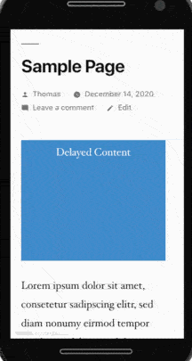
4. Injecting Content Above the Fold
Think of things like top banners, cookie notices, or ads that pop in late. If you’re dropping a div into the top of the page after the UI has already rendered, you’re guaranteed a shift. Every element below the injected content gets shoved down.
The fix is to reserve the space upfront — use min-height on the container so the slot exists in the layout before the content fills it.
5. Flash of Unstyled Content (FOUC)
If your CSS loads late or is injected via JavaScript, the browser renders raw HTML first. Then, when styles arrive, it “snaps” into your design. That visual jump is a major CLS hit.
Avoid loading stylesheets dynamically with JavaScript for anything above the fold. Keep critical CSS in a <link rel="stylesheet"> in <head> so it’s render-blocking — that’s actually what you want for critical styles.
Some Tricks to Avoid CLS
1. Reserve Space for Your App
In SPAs, the #app container is often empty until your JavaScript bundles load and hydrate. During that window, the footer or skeleton content can jump around. Setting a min-height on your main container keeps things anchored.
#app {
  min-height: 900px;
}
You can refine this with min-height: 100dvh if the goal is to fill the viewport, or use a skeleton screen that matches the real layout’s dimensions.
2. Use aspect-ratio
The CSS aspect-ratio property prevents CLS by reserving the exact space an image, video, or ad will occupy before it loads. The browser calculates the height from the width using the ratio — no JavaScript required.
/* The container holds its dimensions before the media loads */
.video-wrapper {
  aspect-ratio: 16 / 9;
  width: 100%;
  background: var(--color-border); /* optional placeholder color */
}

.video-wrapper video {
  width: 100%;
  height: 100%;
  object-fit: cover;
}
3. Lighthouse CI
Use Lighthouse CI for regression testing. You can configure it to run on every commit in your CI pipeline. If a change pushes your CLS above 0.1, the build fails before it ever reaches production.
# lighthouserc.yml
ci:
  assert:
    assertions:
      cumulative-layout-shift:
        - error
        - maxNumericValue: 0.1
This turns CLS from something you check manually into a hard gate — the same way you’d fail a build on a failing unit test.
References